Views and Dashboards
Introduction
Both the Mega report and the Practitioner report have the views and dashboard function. These functions are designed to allow users to customise their experience of the report to their liking. More then just allowing for personalised the views and Dashboards function works to quickly draw your attention to the data that matters to you most.
A view is simply a customisable version of the report allowing you to select, remove or reposition rows in the way you see fit.
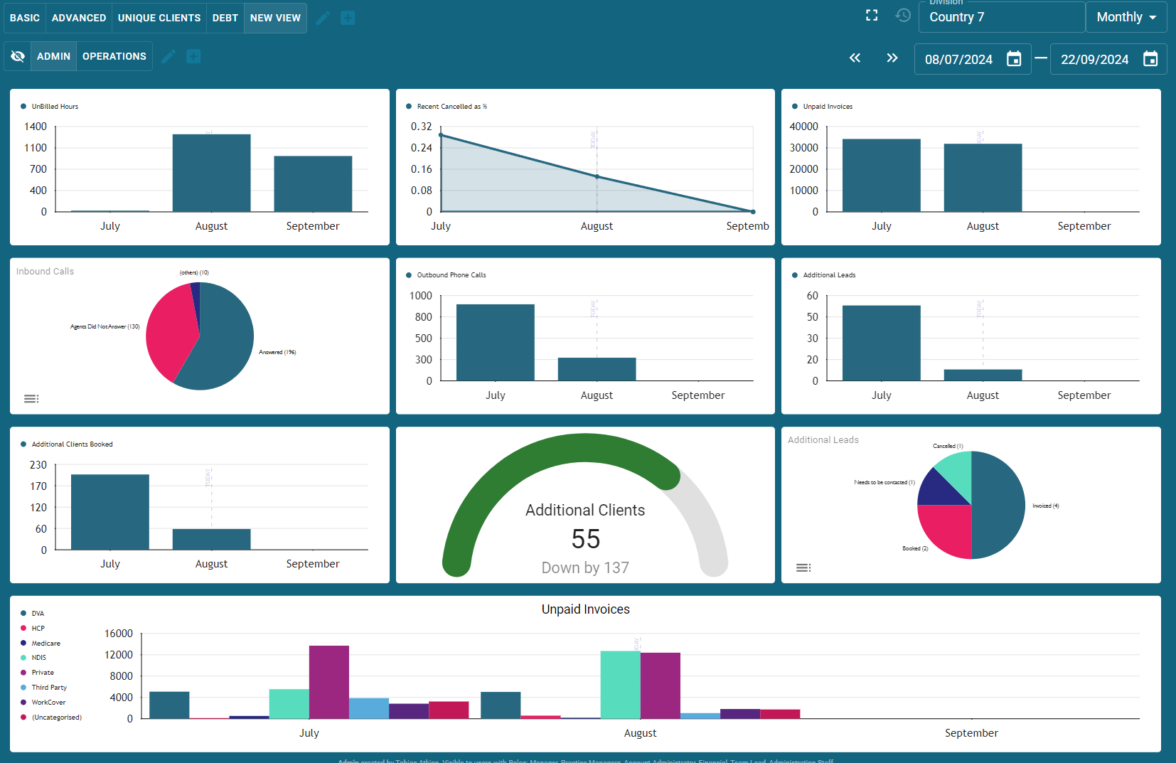
A dashboard is a group of graphical representations of the data.
How to set up a view
To set up a view at the top of the reports click the square with a plus in it in the top row, in this case next to the word "DEBT" and the pencil.
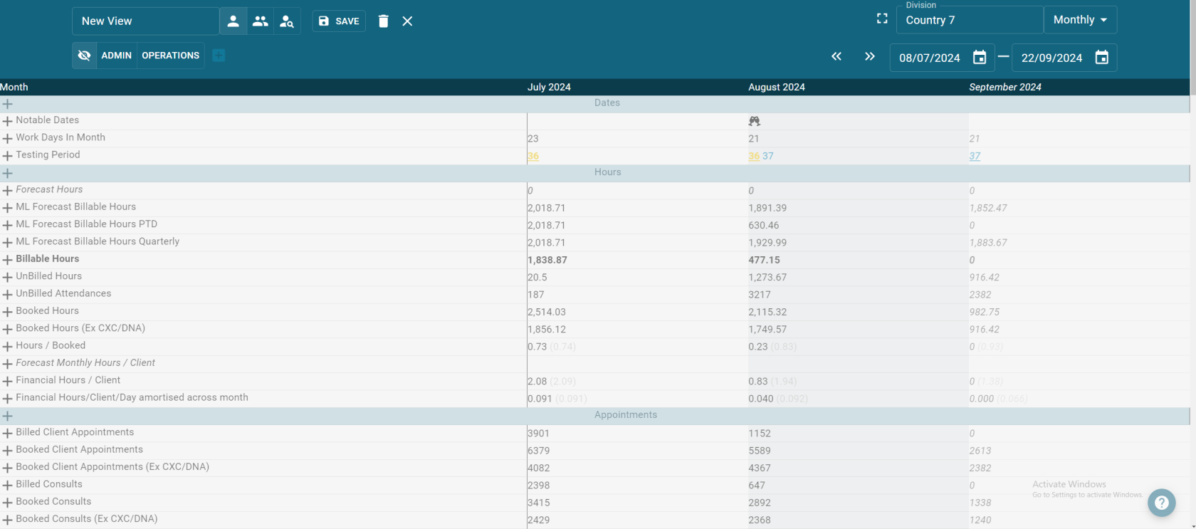
This will bring up a bunch of new options seen below. Name the view and select who you wish to see it. The first icon with one person means you are the only person that will see this new view. The second icon with 2 people means everyone with access to the report will be able to see it. and the icon with a magnifier glass can be used to make it accessible to selected user roles. The save, delete and exit buttons the last few options.

The rest of the report will be "greyed out" with each row having a plus symbol at the beginning of it

Simply click the plus symbol to add the row to the view. Click hold and drag to move and change the order of the rows. Be sure to save your newly created view at the end.
How to set up a dashboard
To set up a dashboard at the top of the reports click the square with a plus in it in the second row, in this case next to the word "OPERATIONS".
his will bring up a bunch of new options seen below. Name the dashboard and select who you wish to see it. The first icon with one person means you are the only person that will see this new view. The second icon with 2 people means everyone with access to the report will be able to see it. and the icon with a magnifier glass can be used to make it accessible to selected user roles. The save, delete and exit buttons the last few options. And now the option to "+ ADD ROW". Click this button to begin...
Select the amount of columns (amount of graphs you want side by side in that row) and begin adding your graph types.
Each graph type has it's purpose... Use line/ bar charts to see trends. Use gauge and number displays to check your hitting targets. There are plenty of configurations for you to play with. Keep in mind only the creator is able to edit their own dashboards...


